- Data Services
- Fraud Prevention
- Solutions
- Resources
- About
- Contact Us
- Login
- Try us for free
Aug 19, 2021 | 7 min read

We are just days away from May 25, when the sweeping set of regulations called GDPR goes into effect and changes the way companies within and beyond the European Union manage data acquisition, privacy and protection.
Marketers are getting serious about re-permissioning their current subscribers so they can comply with one of the chief requirements of the new law – having a clear and transparent opt-in process and being able to prove consumers gave their permission to send them email.
Although the email laws of many individual EU countries already mandate opt-in, GDPR is stringent about proving that the email address owner knowingly signed up for email and being transparent in acquisition, protection and deletion of customer data.
So, to make things crystal clear, marketers for brands that are either based in EU countries or have EU citizens in their databases are sending emails that ask those customers to opt in again for marketing messages.
We provide links to several GDPR resources at the end of this post. But, in a nutshell, this is OUT under GDPR:
Many brands take a no-frills, text-heavy approach in explaining why they were asking customers to opt in again. In fact, it looks as if many brands were using the same template, with just a tweak or two in the copy. Nothing wrong with that, and it surely passed the legal sniff test, but whether it was memorable enough to move customers to act is something we’ll have to wait and see about.
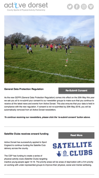
It’s not fancy, and the call to action “Re-submit Consent” won’t set the world on fire. But, placing it at the top of the email under a photo and using a CTA button instead of a text link makes acting on the email easy.
This email from Redeye is similar to many B2B emails at first glance – branded with the company logo and colors but heavier on text than image. But it has a twist:
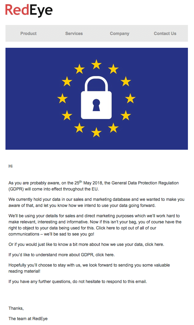
This email is quite different from B2C emails, most of which use bold call-to-action buttons for the opt-in, and even other B2B emails. This email forces you to read through all the copy to find the relevant links to opt out of emails and to learn more about GDPR and how RedEye uses subscriber data. What’s missing? The re-opt-in link.
We’ve been seeing a lot of these GDPR-related emails in our own inboxes (you too?). So, we sought out the most creative tactics marketers are using to persuade their customers to opt in again, and we found some winners.
The UK division of the McDonald’s global behemoth does some terrific email marketing. So, we weren’t surprised to find the brand came up with an email that hits the high notes for a re-permissioning email.
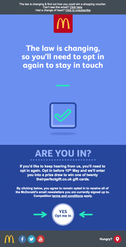
What we liked: What you see here is only the first panel of a six-panel animated email. If this were all there were to this email, it would be enough. The subject line (“This is something you’ll need to know”) is a grabber. The content explains why the customer needs to opt in again and what will happen. The CTA button is obvious and finger-friendly, and the arrows call even more attention to it.
If your mobile or web email client doesn’t support animation, you’ll see only the first panel. Subscribers who can view the animation will see best-practice copy that pledges honesty and transparency, tells subscribers what they’ll get from re-upping and ends with a clear call to action: “Don’t miss out. Opt in today.”
The copy on one panel goes to the heart of GDPR requirements: “We promise to be transparent about how we use your data, to delete your data if you wish, to store your data safely, [and] never to sell your data.”
Brilliant, UK McD’s. It makes up for that “Great Tastes of America” campaign that tries to sell unsuspecting Brits on the “New York Stack:” a burger served on a bagel instead of a bun. We Yanks might be mad, but we’re not that mad.
Who could say no when Wongs pops the question so irresistibly? Not us! Especially when we get a graceful way to bow out, too.
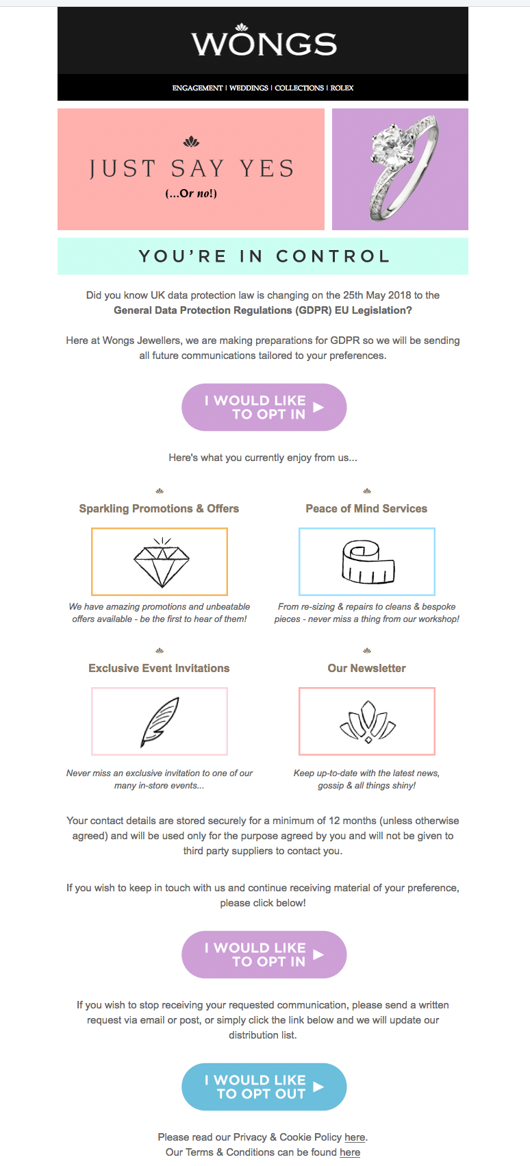
What we liked: Wongs frames the re-permission request like a proposal, complete with an eye-popping diamond. (Sorry, that’s not the reward for opting back in again.) Plus, the reverse bar that says “You’re in control” sums up the gist of GDPR.
What seals the deal was the opt-out button at the bottom of the email. This sends Wongs a clear signal to remove the email address from the limbo of unresponsive customers. (We can hear you now: “Make it easy to unsubscribe? Are you nuts?” No! Unsubscribing can be a good thing, as this blog post makes clear.)
Have yes/no options can compel more people to act. Giving the subscriber only one option – to opt back in – makes it easy for a subscriber who’s on the fence to just pass by without acting. Here, it might persuade more unengaged subscribers (so to speak) to rouse themselves to action and click the exit button.
They had us at the sender line (“Open me, for heaven’s sake) and the preheader reeled us in: “Stick with us and grab a 10% discount code.”
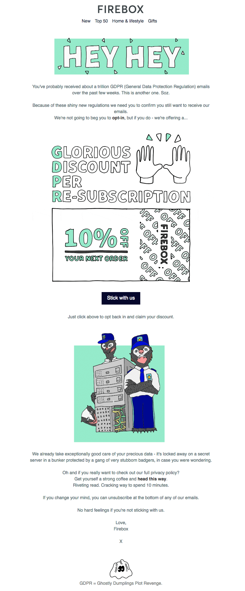
What we liked: What does that four-letter acronym GDPR really stand for? Even we have to look it up once to make sure we get the words in the right order. It’s “General Data Protection Regulation,” but we like Firebox’s interpretation, which combines the action and the reward in a clever takeoff.
Cleverness aside, Firebox has fun with a serious subject without detracting from the important business at hand. Bonus: the “voice” in the copy aligns with the brand and the (frequently) NSFW copy in its regular promotional emails.
This UK department store was one of the first retailers out of the gate in the race to re-permission its subscribers.
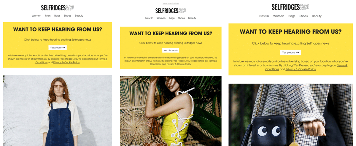
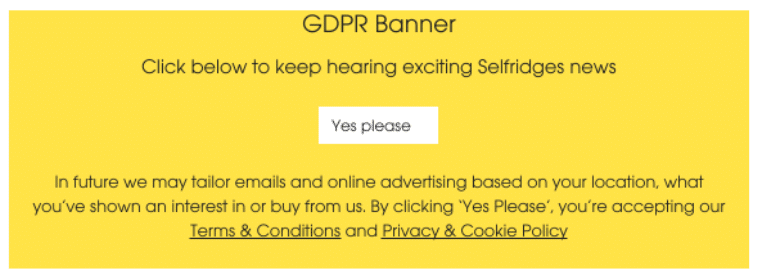
What we liked: Selfridges started its campaign early in January 2018 with this attention-getting banner at the top of each email for several weeks. It’s not an ideal approach, because the email subject line and banner copy don’t mention GDPR or explain why customers need to opt in again. But there’s no missing the alert, which appears even when images are blocked, and it would be an excellent prompter as a follow-up to a stand-along re-permission request.
The teen-and-tween shop that’s in every U.S. mall has a big presence in Europe and Japan, too. So, the U.S.-based corporation sent this email to its EU-based subscribers.
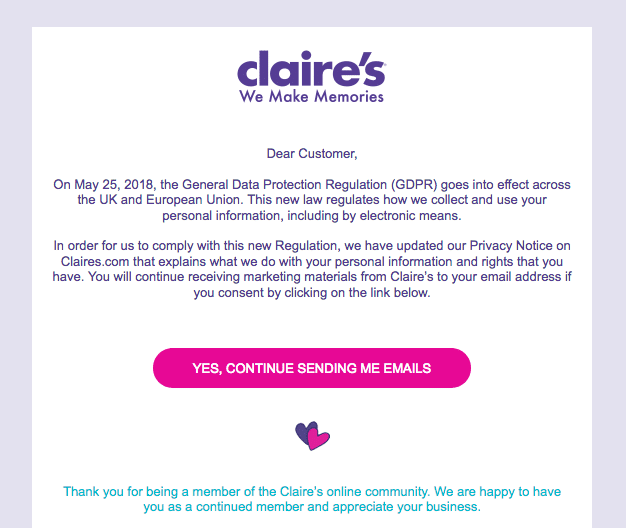
Why we picked this email: At first, we wished Claire’s had framed its re-permission request in language more suited to the under-16 crowd that makes up its customer base. But in comparing this legal-sounding content with its promotional emails, it occurred to us that parents or other adults are the ones who read the emails.
So, it makes sense to phrase the content in adult terms. Claire’s does brand its emails with its logo and official colors, and there’s no missing that brightly colored CTA button.
Even though your company is not based in an EU country, you must follow GDPR guidelines for all your EU-based customers. You might grumble, but many marketers are seeing GDPR as a opportunity to build stronger, active databases.
These resources can help you understand the law, how it can affect you and how you can respond to it: